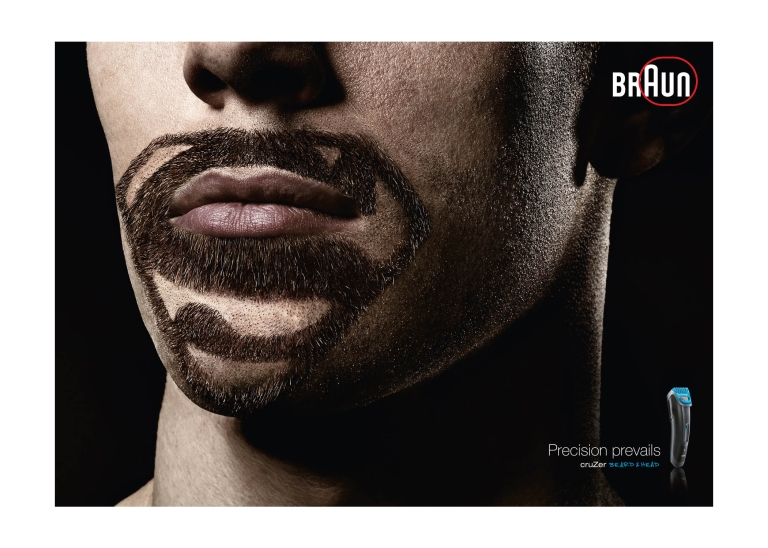
Examining the design of a Braun Superhero Ad
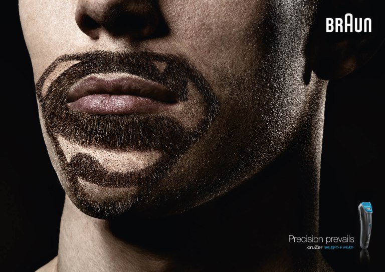
Created by, Advertising Agency: BBDO Proximity, Düsseldorf, Germany. Executive Creative Director: Michael Funk. Creative Director: Olaf Reys. Art Director: Aristotelis Saflanis. Copywriter: Claudius Sperling. Photographer: Stefan Kranefeld
Typography Reverse Engineering
In this reverse engineering article we are taking a closer look at the typography of this Braun superhero advertisement. We are taking a look at the different typefaces that were chosen and dissecting each of them to better understand how typography can be a secret superhero to an ad when used well together. Lets get started.Typefaces 1 & 2
It looks to me like there are two fonts being used within the Braun logo. The BR as typeface 1 and the AUN as typeface 2.
Typeface 1 'BR'
Here we have the beginning of the Braun logo which is in the sans serif category and has a strong bold weight to it. It is in the color of white to stand out and contrast from the black background.

Typeface 2 'Aun'
This second half of the Braun logo follows the same sans serif category of the first while having it’s own repetitive unique look. All are similar to the ‘BR’ with the strong bold weight but pulls together in a smoother look. The size of the ‘A’ stands out as well, I would venture to say to provide the effect of one of their shavers shapes. These are just as the ‘BR’ in the color of white first of all because it unifies with the beginning of the word as well as to have that same contrast.
Typefaces 3, 4, & 5
In the lower right corner of this advertisement is placed more text with less of the focus, but a wonderful contrasting font, providing a smooth flowing communication between the brand and their advertising slogan ‘Precision prevails’, ending with a smaller caption of the items name being sold.
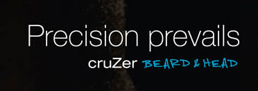
Typeface 3 'Precision Prevails'
This type also is in the sans serif category, but in contrast to the strong bold logo, it features both a slimmer thinner weight, as well as a smaller size. Keeping it uniform with the other they have it in the color white as well.
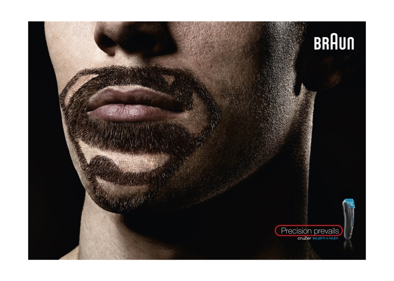
Typeface 4 'Cruzer'
For this type it is a good mix in between the logo and the smaller ‘Precision prevails’ text. They are again using a sans serif category of font. For contrast they have it an even smaller size, and a shorter font. to keep it tied in they repeated the pattern of a middle character being taller than the rest.
Typeface 5 'Beard & Head'
In this last text they have used a font from the decorative category. It is contrasted from the rest from both the different category, and also the blue coloring they chose. It is unified with the razors blue image right next to it and gives it a unique signature look.
Typography Skills Status: Superhero
After taking a closer look at what seemingly simple text has been added to this advertisement, and when realizing the difference it makes finding and using text that flows well with each other, it provides a great example of how important good typography can be to an ad. We all know that words can make a difference, but just as important is how those words visually look and feel.