Examining the design of a Marshals Headphones Ad
Designed by Viktor Kolodiazhnyi
Design & Color Reverse Engineering
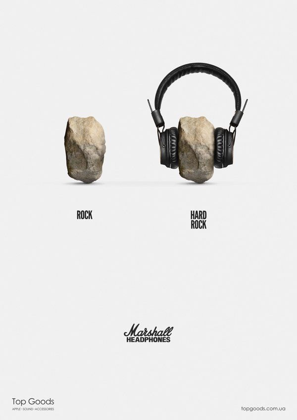
We are taking a closer look at this ad designed by Viktor Kolodiazhnyi that was created for Marshall Headphones. Lets explore the nature of its design by focusing on the four basic elements; Contrast, Repetition, Alignment, and Proximity.CONTRAST
At first glance contrast is easily noticed by the darker content of the page with a light background. There is dark text, and dark objects that appear to stand out very well with the light background behind them. It then has an extreme difference between the stand alone rock on the left and the seemingly simple caption underneath ‘ROCK’, while on the right there is a rock with the headphones and a bit more detailed caption underneath of it ‘HARD ROCK’. There is also the different font for the brand ‘Marshall’ in a more decorated style, leaving the others with a clean and simple look. (I know.. I did not circle that part).
Repetition
Repetition
Repetition
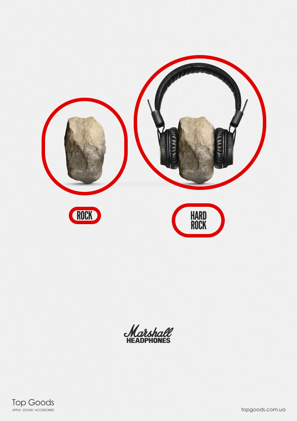
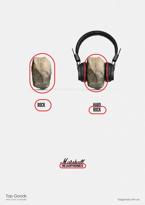
Next we are looking at the elements repeating in the image to develop and provide more organization within the ad and to strengthen the unity as well. You can see from what I circled the designer has the same rock repeated, as well as the word rock. He also has the same font through out. All of that together has given this a more uniform look.
Alignment
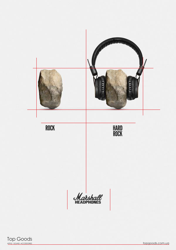
Now we will take a look at the alignment within the ad. I drew in some lines to illustrate the straight and well developed alignment between the elements in the image. The rock images are aligned with each other at the same height. The captions below the rocks are also aligned with each other at the same height. Everything is centered well with the text for the company ‘Marshall’ and the title of the item being sold. Finally we have the sellers information, on the bottom left with the web address in the bottom right aligned together.
Proximity
Next we are looking at the elements repeating in the image to develop and provide more organization within the ad and to strengthen the unity as well. You can see from what I circled the designer has the same rock repeated, as well as the word rock. He also has the same font through out. All of that together has given this a more uniform look.
With the combination of all these principles, (Contrast, Repetition, Alignment, and Proximity), when they are used well together and appropriately, it has the potential to create magnificent designs that are visually appealing and easy to follow.