Getting someone to click on a holiday promotion is only the first step. Your landing page still has to show visitors they are in the right place quickly, make the offer easy to understand, and give them a clear next step.
A strong holiday landing page does not need to be complicated. It needs to create a focused path from interest to action without making potential customers work to figure out what comes next.
1. Start With One Audience and One Offer
Before thinking about colors, images, buttons, or page layout, get clear about who the page is for and what you want that person to do.
A common mistake is trying to make one seasonal page accomplish too much. A holiday promotion can quickly become a collection of unrelated offers, competing buttons, announcements, and links back into the rest of the website.
Instead, start with two questions:
- Who is most likely to arrive on this page?
- What is the primary action I want that person to take?
That action might be scheduling an appointment, requesting a quote, buying a seasonal product, calling the business, making a reservation, or claiming a limited-time offer.
The specific action will vary. The principle is that the page should be built around a clear purpose.
2. Make the Headline Match Why the Visitor Arrived
People may reach a holiday landing page from a social post, email, advertisement, search result, QR code, or another page on your website. When they arrive, the message they see should make sense based on what brought them there.
If someone clicks an advertisement for a holiday service package and lands on a page with a generic headline about the company, they have to stop and figure out whether they reached the right place.
A stronger headline confirms the offer immediately.
Someone should be able to scan the first part of the page and understand:
- what is being offered,
- who it is for,
- why it is relevant, and
- what they should do next.
3. Give Visitors One Clear Conversion Path
A holiday landing page is usually more effective when the next step is obvious.
That does not mean you can only have one button on the entire page. It means your important calls to action should generally point toward the same primary goal.
For example, if the purpose of the page is to generate estimate requests, one section should not encourage visitors to request an estimate while another pushes them toward the blog and another emphasizes following the company on social media.
Those may all be reasonable options elsewhere on your website, but they can become distractions when visitors arrive for one specific offer.
Review the page and ask:
- Can a visitor quickly identify the main action?
- Does the wording on the button clearly describe what happens next?
- Does the action remain easy to find as the visitor moves through the page?
- Are less important links competing for attention?
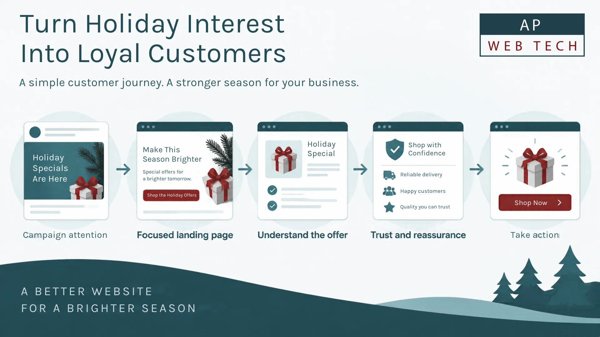
4. Add Trust Where the Customer Needs Reassurance
A clear offer may get someone's attention, but it doesn't automatically make them comfortable taking the next step.
Consider what a potential customer may want to know before acting. Depending on the business and offer, useful trust information could include:
- customer reviews or testimonials,
- examples of relevant work,
- clear pricing or an explanation of how pricing works,
- service-area information,
- business contact information,
- what happens after someone submits a form, or
- answers to common questions about the offer.
The goal is not to cover every possible objection. It is to remove the uncertainties most likely to prevent the right customer from moving forward.
5. Remove Distractions Instead of Adding More Content
When a landing page feels weak, the instinct is often to add something: another section, another graphic, another call to action, or more copy.
Sometimes the better improvement is subtraction.
Look at everything on the page and ask whether it helps the visitor understand the offer, trust the business, or take the next step.
If it does none of those things, consider whether it belongs on this particular page.
This does not mean every landing page should be extremely short. A higher-cost service may require considerably more explanation and reassurance than a simple seasonal promotion. The amount of content should reflect what the customer reasonably needs to make a decision.
6. Check the Complete Experience on a Phone
Do not stop after checking whether the page technically fits on a smaller screen. Go through the actual customer journey on your phone.
Check whether:
- the main message is readable without zooming,
- buttons are easy to see and use,
- navigation or other elements are not covering important content,
- forms are reasonable to complete on a phone,
- images fit properly,
- phone numbers and contact actions behave as expected, and
- the primary next step is still obvious.
The best test is not simply, “Does this page look okay on my phone?” It is, “Can I complete the action I am asking a customer to complete?”
7. Test the Conversion Path Before You Send People to It
A polished page is not useful if the final action does not work.
Before directing traffic to a holiday campaign, test the page as a customer would.
- Open the page from the same kind of link customers will use.
- Follow the primary call to action.
- Complete the form, checkout, booking process, or other conversion step.
- Verify that the submission or transaction reaches the correct destination.
- Check any confirmation message or follow-up experience.
If the campaign is important enough to advertise, email, print, or promote, it is worth testing the complete path before customers find problems for you.
8. Pay Attention to Speed Without Chasing a Perfect Score
A landing page also needs to perform well enough that visitors can use it comfortably. Large images, unnecessary scripts, third-party widgets, and overloaded page designs can all contribute to a slower or less responsive experience.
For a business owner, the practical starting point is simple: open the page on different devices and connections and pay attention to the experience. Does the useful content appear promptly? Can you interact with the page normally? Does content move around unexpectedly while the page loads?
Performance testing tools can help identify problems, but a score by itself does not explain every underlying cause. If the page feels slow and the reason isn't obvious, diagnosis may require a closer look at the site's images, code, hosting, scripts, and other technical factors.
9. Decide How You Will Measure the Campaign
Before the promotion begins, decide what success actually means.
Depending on the landing page, that might include completed forms, calls, purchases, appointments, quote requests, coupon claims, or another meaningful action.
Traffic can provide useful context, but visits alone do not tell you whether the page accomplished its business goal.
It is also worth checking your tracking before the campaign starts. Discovering afterward that an important form submission or button was not being measured makes the results much harder to evaluate.
10. Have a Plan for the Page After the Holiday Ends
A seasonal campaign should have an ending strategy before it launches.
If the offer expires, decide what visitors should see afterward. Leaving an expired promotion online with no explanation can create confusion, especially when old links keep circulating.
Depending on the campaign and your longer-term plans, you may update the page, reuse it for a future seasonal campaign, replace the expired offer with current information, redirect visitors to a relevant alternative, or retire the page.
The right choice depends on the page's purpose and whether it has continuing value. The important part is making that decision intentionally rather than forgetting about the page once the promotion ends.
What Can You Reasonably Check Yourself?
You do not necessarily need a developer to improve a holiday landing page.
A business owner can usually review many of the most important questions:
- Is the offer clear?
- Does the headline match the promotion?
- Is the primary action obvious?
- Is important information easy to find?
- Does the page work comfortably on your phone?
- Do the buttons, links, and forms work?
- Is outdated information creating confusion?
Fixing what you find may be as simple as changing some copy, removing an unnecessary section, or correcting a link.
When Does It Become More Technical?
Professional help becomes more useful when you can identify the problem but cannot easily determine its cause or implement the solution safely.
Examples might include persistent performance problems, broken layouts on particular devices, unreliable forms, tracking problems, complicated integrations, checkout issues, or changes that require modifying the site's code or underlying functionality.
The distinction is important: recognizing that a page has a problem does not mean you need to rebuild the website. Sometimes a focused improvement to an otherwise solid website is exactly what the situation calls for.
A Simple Holiday Landing-Page Walkthrough
Hypothetical example: Imagine a local service business running a holiday promotion through social media.
Instead of sending visitors to its general homepage, the business creates a focused page for that promotion. The page immediately names the offer, briefly explains who it's for, provides the information needed to evaluate it, includes relevant trust signals, and gives visitors one clear way to request the service.
Before promoting the page, the owner opens it on a phone, completes the form, verifies that the inquiry arrives correctly, and checks the confirmation experience. The business also decides in advance what will replace the offer when the promotion expires.
None of those steps require making the page unnecessarily complicated. They remove avoidable gaps between attracting someone's attention and giving that person a reasonable way to become a customer.
Frequently Asked Questions
Do I Need a Separate Landing Page for a Holiday Promotion?
Not always. If an existing page already matches the promotion and gives visitors a clear path to the intended action, creating another page may not add much value. A dedicated landing page becomes more useful when you need a focused message or offer that would otherwise get lost on a general page.
Should I Remove My Website Navigation From the Landing Page?
There is no universal rule that every landing page must remove navigation. Consider the visitor's situation and how focused the campaign needs to be. If navigation creates unnecessary exits from a very specific campaign, simplifying it may help. If visitors reasonably need access to additional information about the business, removing navigation completely may create its own friction.
Should I Create a New Holiday Landing Page Every Year?
Not automatically. If the promotion is recurring and the page has continuing value, maintaining a reusable seasonal page may make more sense than rebuilding the same resource from scratch every year. The key is keeping the information accurate and ensuring expired offers aren't presented as current.
Your Next Step
Before launching your next holiday promotion, open the landing page as if you were seeing the business for the first time. Ask yourself whether the offer is immediately understandable, whether the next step is obvious, and whether you can complete that step comfortably from your phone.
If something feels wrong but you are not sure whether the problem is the message, layout, performance, functionality, or conversion path, talk with AP Web Tech. Sometimes the right answer is a targeted improvement, not a complete website rebuild.