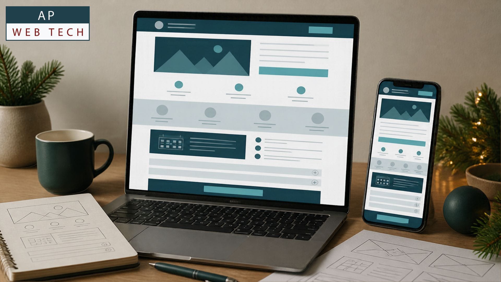
1. Build the Page Around One Holiday Offer
Before choosing colors, images, or seasonal graphics, decide exactly what the page is asking a visitor to consider. A landing page becomes harder to follow when several unrelated promotions, services, or following steps compete for attention.
Start with a specific offer and the audience it is intended for. Then write a headline that explains the important benefit or opportunity in plain language. Supporting copy can clarify what is included, who it is for, and any conditions the visitor should understand.
How to Check
- Write your offer in one sentence without relying on the rest of the website to explain it.
- Read the headline and opening copy on their own. Check whether a new visitor could understand what is being offered and why it may matter to them.
- Remove or demote unrelated promotions and competing calls to action that distract from the page's primary purpose.
- Preview the opening section on a phone so the central message and next step remain easy to find on a smaller screen.
What You're Looking For
The opening should answer three basic questions quickly: What is this? Why should I care? What can I do next? The wording does not need to be clever. Clear, specific language usually gives the visitor more useful information than a vague seasonal slogan.
Don't Panic If
Your business has several holiday promotions. They do not necessarily need to disappear from your website. The landing page can concentrate on the offer connected to the visitor's current journey while other promotions remain available elsewhere.
AP Web Tech's Tip
Draft the offer and headline before designing the page. If the offer takes several paragraphs to explain, simplify the message before adding more visual elements.
2. Give Visitors the Information They Need to Decide
Once the offer is clear, build the middle of the page around decision-making. Explain the benefits, then support your claims with evidence you can genuinely verify. Proof might include customer reviews you have permission to publish, recognizable product or service details, relevant credentials, policies, or other factual information that reduces uncertainty.
A seasonal deadline can create useful context when it is real. State what the deadline applies to, such as ordering, booking, redemption, or availability. Avoid false countdowns, unsupported scarcity, or urgency that resets when the visitor returns.
How to Check
- List the main reasons someone would choose this offer and rewrite them from the customer's perspective.
- Place relevant, verifiable proof near claims that could otherwise require trust.
- State the actual deadline or availability conditions clearly when the offer has them.
- Review every testimonial, statistic, credential, guarantee, and scarcity statement and confirm that you can substantiate it.
What You're Looking For
Visitors should be able to move from the promise to supporting information without hunting through the site. Benefits explain the value; proof supports the claims; accurate conditions tell visitors what the offer actually involves.
Don't Panic If
You do not have a large collection of reviews or formal case studies. Do not invent social proof to fill the space. Use the reliable information you actually have and concentrate on making the offer, process, policies, deliverables, or product details easier to understand.
3. Finish With FAQs, a Real Deadline, and One Clear Next Step
The bottom half of the page should address reasonable objections instead of introducing an entirely new sales pitch. An FAQ can cover questions about eligibility, delivery, scheduling, returns, availability, pricing conditions, or what follows after someone responds.
Then make the desired next step obvious. A CTA, or call to action, is simply the action you want the visitor to take, such as purchasing, requesting a quote, booking, calling, or starting an inquiry. Button wording should describe the action accurately.
How to Check
- Write down the questions a customer should reasonably answer before accepting the offer and turn the most important ones into a short FAQ.
- Confirm that prices, dates, availability, exclusions, and other offer conditions agree everywhere they appear.
- Choose one primary action and make that action prominent at useful decision points on the page.
- Test the page on a phone. Open the CTA, submit the form where appropriate, follow important links, and check the next step of the journey.
What You're Looking For
A visitor who reaches the CTA should understand the offer and what happens after they take action. The CTA should stay easy to identify and use on smaller screens, rather than getting buried among competing buttons.
Don't Panic If
The first version is simple. A focused landing page does not require complicated animations or an elaborate custom design to communicate effectively. Get the offer, information hierarchy, mobile experience, and customer journey working first, then refine the presentation based on what you learn.
Frequently Asked Questions
How do I create a landing page for a holiday promotion?
Start with one offer and audience, then organize the page around a clear headline, customer benefits, credible proof, an accurate deadline when applicable, a short FAQ, and one primary CTA. Test the finished journey on both desktop and mobile.
Should a holiday landing page have its own URL?
A dedicated URL can make a focused campaign easier to link to and measure, but the best setup depends on your website, campaign, and whether the page will remain useful after the promotion. Avoid creating near-duplicate seasonal pages without a clear purpose.
How many calls to action should a landing page have?
You can repeat the same primary action at appropriate points on a longer page. The important distinction is between repeating one clear next step and presenting several unrelated actions that compete for the visitor's attention.
What should I put above the fold on a holiday landing page?
Focus on the information a visitor needs first: the offer, a clear benefit-oriented headline, essential conditions or timing when relevant, and an obvious next step. Check the mobile view rather than assuming a desktop composition will translate cleanly.